Self assessment of previous assignments
Carry out a written self-assessment of each of the previous assignments, noting successes and problems that need to be resolved. Hopefully you’ve already done this during the course; if so, revisit your earlier notes and add any new thoughts. Next, select one of the previous four assignments as the starting point for your personal project.
The options are:
- Line, space and form
- Your immediate environment
- Outdoors
- The figure and face
Assignment 1
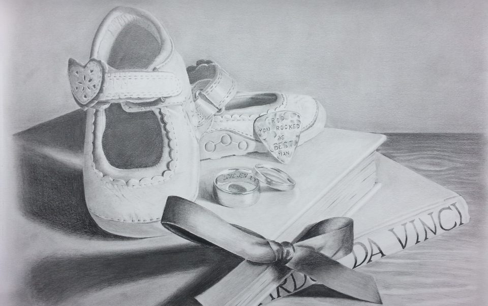
The exercises at the beginning of the course were the perfect kick start I needed to get me on track again with my drawing. I learnt about composition, I improved my hatching and was confident that I had produced my best ever pencil drawing to date. I had decided to draw a selection of items from my personal life that mean a lot to me. I was very pleased with the detail and textures I had achieved and surprised myself how realistic the objects looked. The problems I encountered were I could not get the darks darker without wearing out the paper, I did not know what to do for the background and regretted adding any as it looked better with plain white.
My tutor said that the personal importance of my choice of objects came across, the drawing was detailed, tight even, but very tender. The shoes being so large gave it a slightly surreal quality- a bit dreamlike and spooky. It was very well observed and the range of lights and darks achieved kept it interesting. She said It looks like I had pushed some of the tones and this was a good idea and said I should think about doing this even more in future with other drawings. She also suggested that I could have some areas washed out and others more intense. The level of detail in parts of the shoes contrasts nicely with the more delicate treatment of the pages of the book and that I should think about varying the amount of detail within an object, really intensifying areas and leaving others almost blank.
Assignment 2

For assignment 2 I decided to draw my friend on their horse during a riding competition, I was happy with my choice of media as the pastel gave a lovely texture to the horses coat which I think I successfully showed, I also edited out some of the items from the photo that I thought were not required and that would have made the drawing too busy detracting interest from the subject. I was happy with the detail achieved especially with the saddle and horses face. Proportions were also good. Problems I encountered were the drawing is too static as through inexperience I was not sure how to create a sense of movement. I do find it difficult to leave parts washed out and tend to overwork. The background is not great with maybe not enough detail and graduation from bottom up. The pastel pencils were good except they kept breaking when I was trying to sharpen them, I also had problems with pastel dust spreading over the drawing. My tutor said my subject matter a show jumper, has potential. I had edited out information to arrive at an intriguing composition. The detailing of the horses flesh with the pastel is well done. The blurring of the background could suggest distance, but it is too separate from the main action. Using blurring in other areas, such as parts of the fencing or the hind quarters of the horse could suggest movement. The drawing is too static. Which is often the result of working from photographs.
My tutor also said a very useful quote which I would like to add and refer back to in the future, Realism is achieved through observation, but it is important to understand what observation can be. When we look, we naturally edit the information in front of us; some things are given more importance than others. Keep this in mind when working from life and, especially, from photos. Do not let the same level detail be in evidence throughout. The design of the picture plane is just as important as observed reality. It is the relationship of areas that draws the viewer in.
Assignment 3
I searched for a long time for this view and wanted an interesting scene with lots of angles to show perspective, I chose the football training ground at the back of Billericay football club viewed through the mesh of the gates. I changed a lot of the detail removing objects not required and adding a dramatic sky and light from the floodlights to add atmosphere, doing a monochrome drawing with a touch of colour also added to the atmosphere. I think the composition and choice of viewpoint was successful and made the scene more interesting than it actually was. Problems I have noticed with the drawing is a lack of realism with the cabins I think due to using pastel sticks and the fact it was a very dull day so not much shadow was visible making areas look flat. I think if the clouds and cabins had been more realistic it would have been a better drawing. My tutor said my drawing of Billericay football club has a lot going for it. With a characteristic mix of careful observation, meticulous planning and creative invention I had come up with my best drawing yet. The use of yellow in one place is effective, as it really stands out against the monochrome. The composition works well with the angle of the fence creating sections to look at: these sections all have different characters but read as a whole. She said I had achieved a lot of different surfaces with a careful use of charcoal. The mixture of expressive clouds and delicate work on the fence and goal posts creates interest. The drawing is so successful because it is quite complex. I had made decisions to change things for the sake of the drawing and not been a slave to what is out there. She said to learn from what I have done here and do more like it.
Assignment 4
I wanted to do something personal for this assignment so chose to draw members of my immediate family, my daughter and wife.
Drawing 1

I am more than happy with the way this turned out, it looks so much like her and the proportions are very accurate, the best portrait I have done so far. I am really pleased with the composition and with how the layering of pinks yellow and grey came out on her face and hands. My aim was to use detail in the face to create a focal point and wash out or have less detail within the rest of the drawing, instead of drawing the shadow present at the time I made the decision to try out just using a black line where the shadows would have started and I feel it worked well enough to create form without overworking the drawing. Problems I came across were with hair colour due to lack of experience with colours and a slight issue with perspective on the draws and mirror, If I were to do this drawing again I would probably crop the mirror out of the drawing.
Drawing 2

The subject and proportions are good and I am pleased with my choice of viewpoint and lighting, I have observed details well and there is a very good likeness to the model. It looks like she is firmly planted on the sofa due to the shadow on the cushion beneath her and creases under her feet, I especially like the hands and hair. I was surprised how quickly i did this drawing (2 hours) and think it must be due to having taken some life drawing classes. I was loose and relaxed whilst drawing and just went with the flow, I feel I have turned a corner with my figure drawing as I have improved so much and got a lot more confident. Problems with this drawing are I overworked the background making it too busy and detracting the interest of the main subject the model.
Drawing 3

I kept to the brief keeping features believable and in proportion, drew her in an interesting position, used variation in tone and expressive line, I created atmosphere and captured her personality well. I showed this drawing to family members and they thought it was lovely and really captured her look and personality. The main criticism I have personally is her hair colour looks ginger when it is actually more blonde and I should have added more shadow to the right side of her face. Also her ear looks a bit flat.
My tutor said this is a very good collection of work and I have taken forward my strengths to make for diverse work showing off my skills of being expressive and being quite realistic.
Drawing 1 – I have concentrated on features, tonal flesh colours and a difficult foreshortening pose. The choice of media and colours suits the subject matter. The work speaks out, as the face is the focus so I have made the right and interesting decision to fade everything else. A well thought out composition.
Drawing 2- My tutor said this is an ambitious piece as it is a complex composition. A challenging pose which has shown that I can foreshorten and challenge myself to more complex poses. Tonal qualities are subtle and bold in the right places, which gives depth to the figure. However, I have over-worked the background as there is a lot to take in and this distracts the focus of the main figure. The background could be subtler and not so dominating. Also, the patterned cushion is quite odd looking as it is the only patterned texture in the piece.
Drawing 3- No comment
Artists Statement
Combining detail with expressive marks within a portrait.
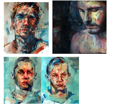
I have chosen to draw a portrait combining a high level of detail with expressive marks as I very much enjoyed my first assignment drawing which was a very detailed still life of some meaningful personal belongings. I also enjoyed part four of the drawing one course the face and figure, although I found it difficult it is a subject I really wish to be good at and I feel I improved quickly and my final drawings in part four showed huge improvement and potential. The reason for combining detail and expressive marks is I find it hard to be expressive when drawing and feel I need to enhance this side of my work. I really admire expressive artists portraits such as contemporary expressive and abstract artist Danny O’conner

Ryan Hewitt contemporary African artists surreal, creative, loose layered technique creates a pictures with a mix of realism and abstract

Florian Nicole, French digital artist and illustrator

David Agenjo, Spanish artist who uses his previous canvas used as a palette as the base to his next painting creating unpredictable abstract qualities to each piece of art
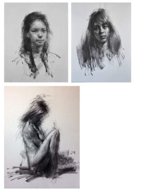
Artist Zin Lim from South Korea, as well as his fine art portrait paintings he also creates expressive charcoal portraits starting with very expressive marks then removes tone and adds detail until eventually an impressive expressive portrait is uncovered
The materials I plan to use are Charcoal on paper due to its expressive and adaptable marks with maybe some water colour wash for colour, ink for deeper darks and torn collage applied before the drawing for added texture and expression. I will experiment with different expressive techniques such as Zin Lim method of charcoal portraits and also experiment with adding high detail before or after the expressive marks.
Experiments
1. Can drawing onto a damaged background of a found support add expressive qualities?
The purpose of this experiment was to find out if using found support such as an old discarded board game box would create a more expressive and interesting drawing.
To do this I chose an old scrabble box, I immediately realised the surface was not going to hold any medium so decided to tear and lift parts of the surface so I could draw using ink and add a wash with watered down ink, I had already chosen my subject which was my daughter. During the tearing I noticed beneath the initial covering was a dark textured surface so decided to use this to represent her hair. I then used hatching in ink to create form and used coloured pencils for shading the face. I added watered down ink to areas of the background and used white out paint for extra highlights.
Coloured pencil and ink on torn game board

Although the found support was a little random and had no correlation with the subject the rough, bold and messy background did contrast with the face making it stand out. The tearing reminded me of an old street poster where over the years people had tried to remove it. It does add expressiveness to the picture but not really to the subject, I think if the subject was not static then the tears used in the correct way could have been used to suggest movement.
2. What qualities do high contrast tones give to a portrait?
The aim of this experiment was to determine what feeling high contrast tones between black and white create and would it add to the expressiveness I want to acheive.
Charcoal on A2 cartridge paper

For this drawing I decided to scale up the face to focus more on the features and I wanted more negative space so chose to draw in landscape. The paper I chose was a good surface for charcoal and it was a nice composition but my intention was to be expressive when drawing, for some reason this didn’t happen and I ended up doing the opposite by blending the face and filling in the background. I should have resisted the blending and left the marks adding more tone to the shadow sides of the face. The high contrast in the background does however add a sense of drama.
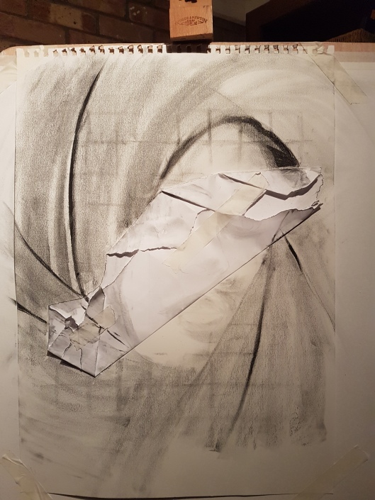
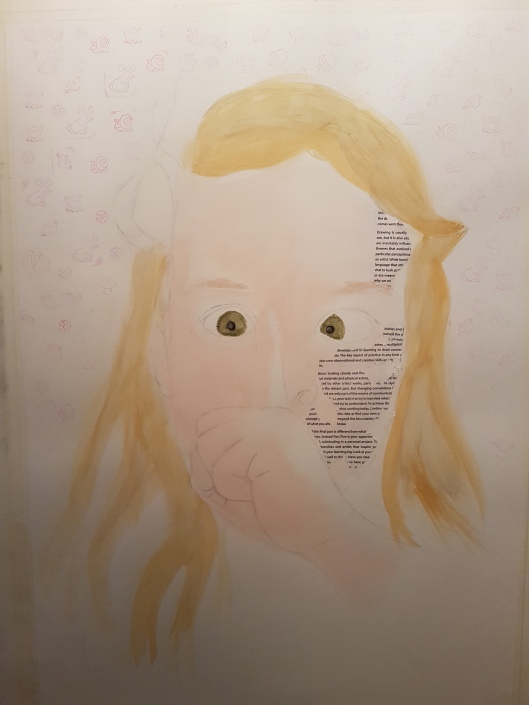
3. Adding torn collage to support before drawing.
Mixed media on A2 paper with torn paper applied before
 –
– 
I began by adding some torn paper to my support around the area I intended to draw the eyes. I drew the features and added hatching using ink pen and then applied ink with a brush for some shading on the picture. Some car spray paint I had lying around was used to add dark and highlights and expressive marks with smudges. I felt this was quite an expressive picture but I wanted to achieve more detail perhaps around the eye. I like the dark marks on the chin against the softness of the lips and I also like the smudge of black and white spray paint across the shoulder, this wold be good if placed somewhere else for example along the left side of her face. The torn paper did add interest to the eye, especially where the sharpness of the tear line across the eye.
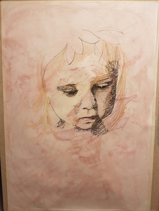
4. What qualities does a found printed image added to the support give to a portrait?
Charcoal on A2 250gsm cartridge paper with torn map applied before


I found a photocopied map I had lying around and randomly spread glue on the back before placing on to my support, once dry i ripped off from right to left and removed any loose ends. I then lightly drew the face in pencil and then completed the drawing in charcoal. The torn map gave a good textured wrinkled look which suited the subject well, I also like the effect of where the edge of the map catches more charcoal, the remnants of glue also adds texture. I thought the map was a good choice as the man looks lost & possibly homeless. I also like the way the top of the head fades away.
5. Collage ripped off midway through drawing?
Charcoal & ink on A2 250gsm cartridge paper with paper section glued on and ripped off half way through drawing


I began by drawing a grid (note, do not erase a grid as leaves marks) and gluing the paper where I intended the eyes to be drawn. I then drew the everything but the face in charcoal. I ripped off the glued paper and added the more detailed features starting with ink pen and adding in charcoal. I added some white paint for eye highlights.
The paper I ripped away was positioned nicely and added drama to the picture, the idea was to be more detailed on the torn paper but it does not show, nowhere near enough iris detail. If I were to repeat this experiment I would draw the detailed piece first then be loose with the remainder of the drawing, I would also use a smoother paper and a very light grid or not use a grid. I suppose the torn paper could also represent her life being torn apart before her eyes which makes the drawing more interesting.
6. The effectiveness of line and wash with mixed media applied after.
I wanted to see what a line and wash drawing would be like with charcoal added after.
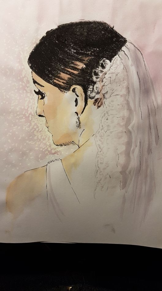
A good likeness and i like the colours and tones of the wash on the face. Adding a thicker texture to the hair with charcoal gave a greater sense of depth to the portrait. This would have been more successful if the face edge and eye was lighter and more delicate with the veil more detailed or suggestion of detail.
7. Can expression added to support as a background before a drawing work to create an expressive portrait?
Watercolour wash and drip & torn paper applied before drawing in Ink on A2 paper


I like the expressiveness of the background and I do like the drawing but it is too mechanical. Although it could be a good base to work further on I think it would end up being over worked.
Adding expressive marks before the portrait felt like cheating but if you have studied the subject and know where you are placing the face then I think it is acceptable as the expressive marks can still be part of the portrait features with the detail added later.
8. Can an undercoat of watercolour wash and loose expressive marks to suggest form, show through a charcoal portrait with good effect?
Torn paper, watercolour wash & drip with coloured pencil added before drawing in Ink finished with charcoal on A2 160gsm fine grain cartridge paper


I really like the texture of the forehead and bridge of her nose. I like the colour showing through and the expressive marks showing through on her face. There is not enough detail for the eyes. I do think this technique of an expressive base for the drawing has potential but this was overworked mainly in the background. Maybe if i had just done a fading outline for the top left of her head this would have been a better drawing.
Conclusion of experiments
If using a grid make it very light and do not erase as it leaves marks.
Don’t be tempted to always blend in the medium as rough marks and hatching can make the drawing more expressive & interesting.
If adding torn paper or collage make sure it is strategically placed. Collage is better if it has meaning, for example the map.
Fading outlines in some areas of the subject would create depth and draw the viewer toward the face.
Expressive marks applied before the subject of the portrait is drawn can be successful and have meaning if you know who you are drawing and have studied the subject and plan ahead knowing where on the paper the subject will be placed. The expressive marks would be better if made part of the subject for example the shadow or edge of the face.
Research point
Giacometti- look at his drawings and how he uses expressive and experimental marks to depict the form.
My tutor suggested I take a look at the drawings of Alberto Giacometti, he was a Swiss sculptor, painter, draughtsman and printmaker. His work has been described as Surrealist, Existentialist and Expressionist.
Many of his portrait drawings are made up of expressive marks, smudges and drips varying in colour,size and direction. At first glance they look almost random with the whole drawing drawn in a loose free flowing style but looking closer many of the lines appear to be following the underlying structure of the face, with darker colours and more randomised directions for the shaded areas. There is precision within the face with the features which are the most detailed areas and the remainder of the drawing consists of more basic marks and generally thicker lines. A lot of his figures are at an elongated scale with a smaller then normal head, these drawings are said to represent the shadow that is cast of the subject not the human figure itself.
Final Piece
Watercolour, printed text paper and animal stamps applied before charcoal on A1 300gsm snowden white cartridge paper


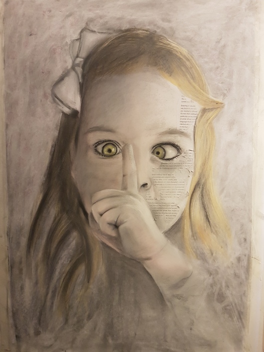
I feel the text print does not work as it has no meaning, I do not like the background and the hair is disappointing. My intention was to create a comical picture but this is conflicting with the dark style and looks more sinister than humorous. I am also regretting working on A1 in a confined space.
To see if the colour combined with the dark style is working against me I adjusted the drawing using a digital program to see what the drawing would have been like in black and white

the drawing is definitely less sinister, so I going to dull down the colours, remove the text print, redo the hair and generally enhance the whole drawing.

I feel the drawing is improved and not so sinister looking although maybe overworked. The damage caused by taking off the text left the paper impossible to work with, I regret not being more detailed with the hand as this is at the front of the drawing but this was impossible due to overworking that area and the charcoal would not hold on to the surface. I should have been more expressive with the base drawing/sketching as I was in some of my previous experiments. I should have faded out areas and been looser and more rough with my marks.
